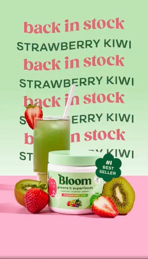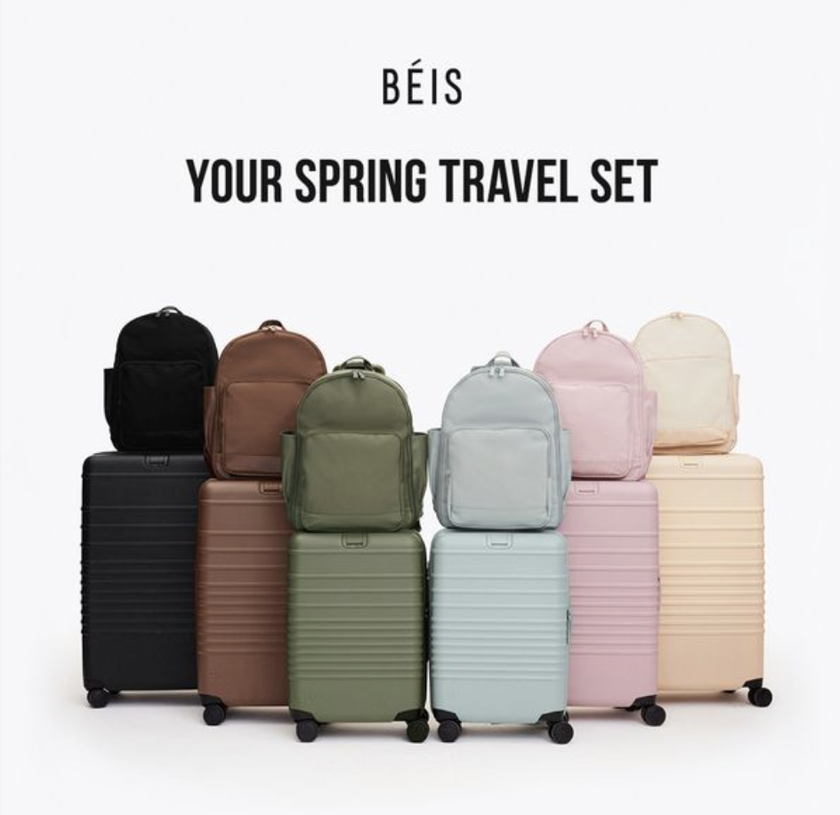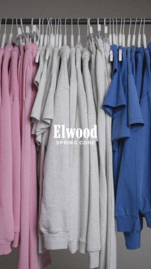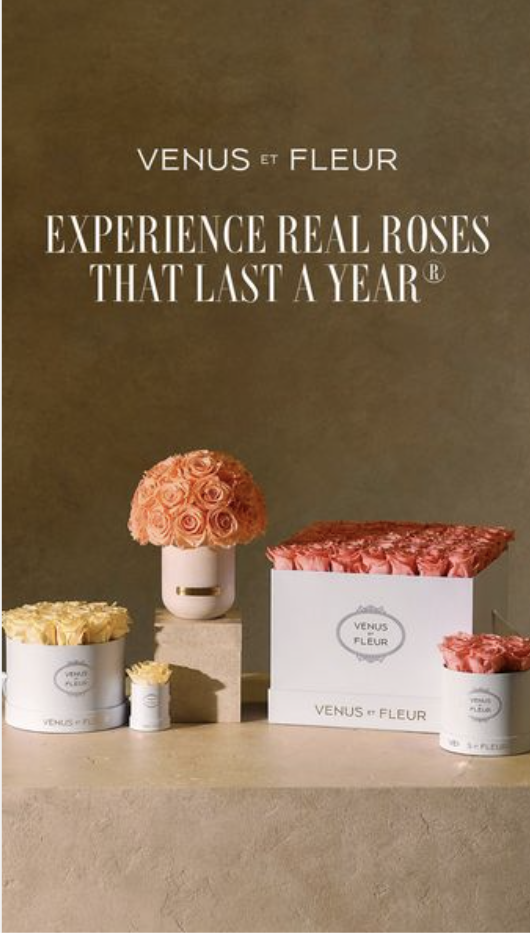
It has come to my attention that some of us are not pulling one of my favorite growth levers: being interesting to look at.
I mean this: if your creatives don’t feel interesting, or worse, they’re not performing…are you experimenting with color in a big way? Are you pushing your brand guidelines and playing less demure? Subtle is cute, except for in ad creative. There’s no time. You are interrupting someone’s flow when your ad is served. Might as well make it beautiful.
Beautiful here doesn’t mean perfect. It doesn’t even mean on brand. Beautiful means exciting – means captivating – means – INTERESTING TO LOOK AT.
Color does this. Especially color as a way of storytelling. When I have an ad that’s doing well, I make iterations that play with color. Do you? Should you?
The below ads I hope will help me to tell you a color story. Each of these could serve as creative templates for you to copy. Steal. Ways to push your creative team to push the boundaries with color.
Because I think a lot about ad creative. I save a lot of ad creative. My team makes a ton of ad creative. And, as always, my favorite ad style is the style that brings in the most money.
Copy these colorful styles, put your brand’s spin on them, and get them deployed without 5 rounds of approvals, okay?
(Click each ad to see the link the creative linked out to – the landing page is a huge factor in ad creative performance as you know so study the landing pages pairing!!)