^ Self-portrait.
Dark-mode creative. Let’s discuss. 🧛♀️
Vampy, dark, moody creative is just as powerful as colorful, bright, in-you-brand-colors creative. I want you to do it all. 🧛♀️ 🧛♀️ 🧛♀️ 🧛♀️
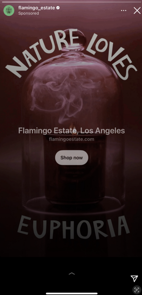
Because all styles have a place. We’re trying to be EFFICIENT. Meaning we have to be interesting to look at. No creatives have a shot if they just blend in. Dark-mode is something you need to promise to mix in to your ad accounts.
Notice that all of these are dark – but not all traditionally dark-mode (not just black background white writing). Some are, but some aren’t. It should just feel like not all creatives are the same note. The best performing ad accounts do this and refresh this mix OFTEN.
You’ll see the range across all of these examples…it’s vast. Range is a good thing – each of these brands is playing with color and that’s the point.
Steal these styles, put your brand’s spin on them, and get them deployed without 5 rounds of approvals, okay?
(Click each ad to see the link the creative linked out to – the landing page is a huge factor in ad creative performance as you know so study the landing pages pairing!!)


