

There’s a particular thing I love about each of the websites listed below. These are website examples that I implore you to study and learn from and copy and then you’ll make millions. This is my wish for you.
: ARRAE’S full screen email + SMS popup that ASKS A QUESTION! I screenshotted it and zoomed on this part (this is the 1st card of the multi-step popup):

: WHAT A MOMENT FOR ROYALTY. I will not lie to you. I am on Kate Middleton TikTok and I am also watching the launch of American Riviera Orchard (by the Duchess of Sussex… like a hawk). I really like this splash page. HOWEVER, I AM SHOCKED TO SEE THAT THE AGENCY THAT DID THIS SITE PUT A MADE BY TAG IN THE BOTTOM RIGHT CORNER. This site better have been free…

: THIS BIRKENSTOCK + STAUD collections page on the STAUD website does 1 of my favorite things: it leaves room in the collection for cards that aren’t product cards. Hype cards (lifestyle images intermixed with the standard product cards) Do you see? Notice they don’t follow a specific pattern – that’s my preference, too!
: PANGAIA does the same thing on their collections page (this is the site I reference for this collection page lifestyle card trick). In my brain, they invented this. I love it. I have since stolen it on many a website LOL.
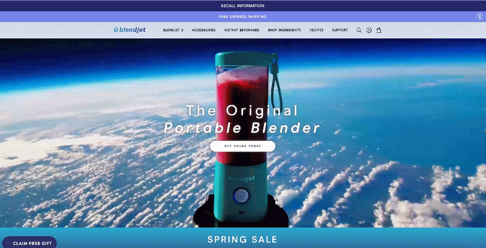
✈️: BLENDJET’S HERO HOMEPAGE IS SO LOUD. I love it. I also have to be honest with you. I watched this for 15 seconds before I saw that there was a RECALL INFORMATION banner / notice in the promobar. I consider this to be genius. Bad news and legalese sometimes do need to be on your website. But a little distraction can go a long way (as it does here)…
: EIGHT SLEEP’S REVIEWS SECTION IS ALIVE. It fits in on homepage (below the fold, where it belongs). It shows Andrew Huberman. Elon Musk. Lewis Hamilton. But, all I see is ANDREW HUBERMAN on VIDEO talking to ME. I will be borrowing this exact layout, thank you kindly.

: DANIELLE FRANKEL STUDIO’s homepage hero says nothing. The left side of the split-screen hero doesn’t even show their clothes! I think that’s the whole point.
: SIXPENNY’S HOVER STATE on their swatch collections page really does it for me. I need to see more than a swatch – I need something to copy LOL. This helps.
️: TRUDON’S ART OF GIFTING PAGE isn’t the most high tech. It is clear. And old-school. Like the brand. I plan to copy it. Maybe make it a bit more tech-forward but then again, maybe not.
: SELF-PORTRAIT’S COLLECTIONS PAGE is yet another example of a lifestyle card interrupting normal product cards. I’m telling you – this really works. Will you try it?
: THE SKINNY CONFIDENTIAL’S LATEST SPLIT-SCREEN HERO IS ICE COLD.
️: KOSAS’ SITE PRODUCT PHOTOGRAPHY. THAT’S IT! THAT’S THE COMMENTARY. They’ve set the standard here for me for so long.
⏱️: ROLEX SPONSORSHIP IN THE BNP PARIBAS OPEN APP looks just right. Open the app, tell the time, with a Rolex clock! Sometimes I wish I was the type of marketer who could think of something like this. I really would like to be.
