There’s a particular thing I love about each of the 12 websites listed below. These are website examples that I implore you to study and learn from and copy and then you’ll make millions. This is my wish for you.
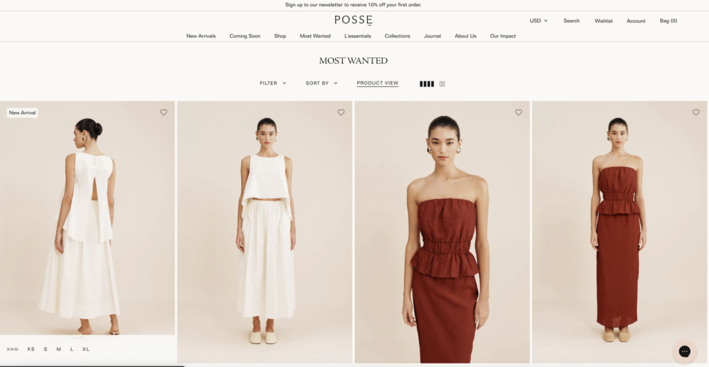
1️⃣. POSSE’S MOST WANTED Collections Page. Best selling is basic. MOST WANTED hits really hard. I prefer this verbiage and I feel like every item on this page feels pre-approved by all the cool shoppers before us. Fab. 🏅
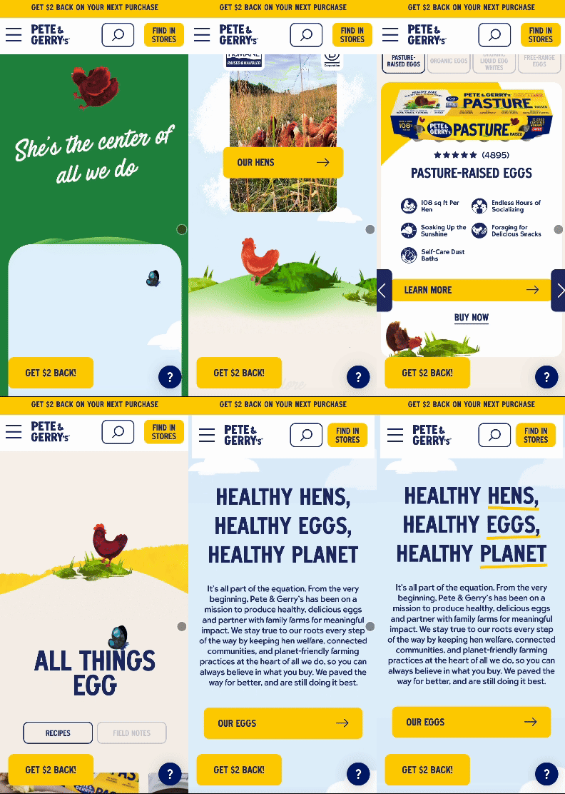
2️⃣. PETE & GERRY’S homepage has so much personality. So much going for it. And, a really compelling $2 back offer. My sister showed me this site and recited their tagline to me as I was googling for the link. She has it memorized. Quite powerful! HEALTHY HENS, HEALTHY EGGS, HEALTHY PLANET. 🪺
3️⃣. HELSA STUDIO’s about us page is so simple and therefore so different. It’s also not overly long. How refreshing. It also feels like she wrote it, not her team. How refreshing. The photo of her with her child says a lot more than an animation or fancy trick ever could. Something to consider! 🇸🇪

4️⃣. Lacoste’s semi-annual sale collections page navigation shows not tells. Love this layout and will try it for my next sale. 🏷️

5️⃣. Sezane’s PDP carousel images are SO SHOPPABLE. Because the variants aren’t separated – I scroll from white to deep blue to striped blue and each time I click I can tell the shape of this shirt more and more. There’s an abundance of images, and with each click I am not sold on getting 1 shirt. I’m sold on getting SHIRTS. I accidentally bought 3. This is the way to sell clothing variants. Très bien. 🇫🇷

6️⃣. Wonder Valley’s footer. Forever. ♾️

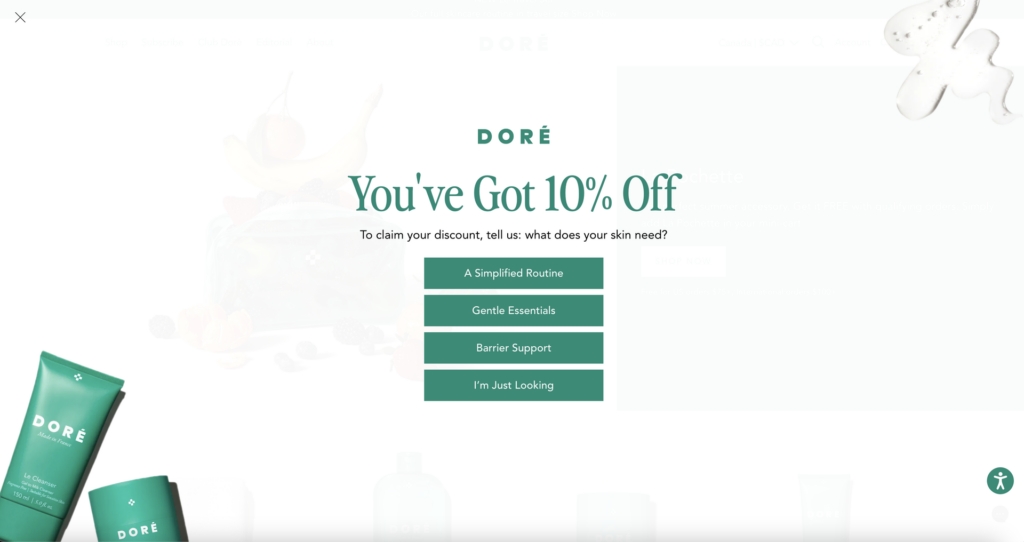
7️⃣. Doré’s email capture turned quiz-funnel. If you’re not testing a slightly opaque, full screen takover popup… you must. Go live with this test this week. Please. 🧴
8️⃣. Sixpenney’s search. The customization secondary CTA is inspired (see the call out for Customization is free.). Lead them where you want them to go (here, they’re guided to go build exactly what they need). 🔎

9️⃣. The Skinny Confidential’s split-screen hero. I work on this site and across growth for the brand. 🧊

🔟. Koh’s PDP carousel is 1 infographic after another after another. Works like a charm. I work with Koh and their product is sooooo beloved (and easy to understand with help from the 40 infographics). 🌎

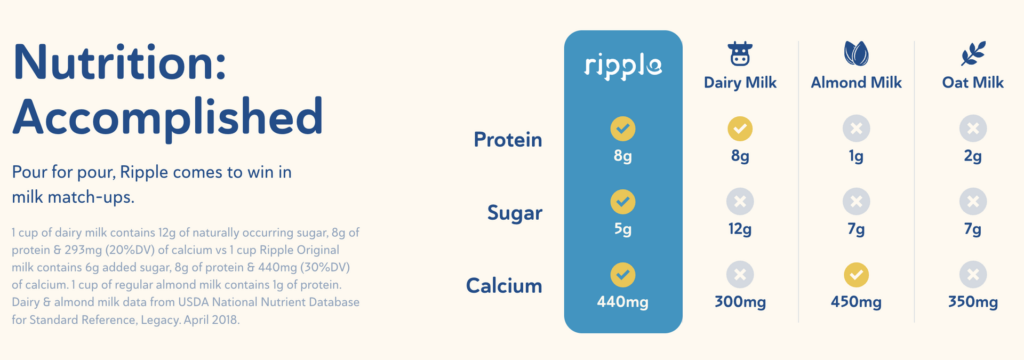
1️⃣1️⃣. Ripple Foods does such a great job on their comparison charts (makes sense because they win against all the other milk types by a mile). I helped work on this site and I LOVE THE PRODUCT. So creamy in coffee. 🥛
1️⃣2️⃣. AUREUM’s below the fold module (right above the footer) really says so much while writing almost nothing. It’s 1 of the most confident module’s I’ve ever seen – almost at the bottom of the site and so good it could be hero, but so confident that it is at the end. Chills.

