ON THIS EPISODE OF GO-TO-MILLIONS
You know how important your email popup is and yet you likely aren’t spending enough time making it better. Good news is the bar is on the fucking floor. 🧛♀️ 🧛♀️ 🧛♀️ 🧛♀️ 🧛♀️ 🧛♀️ 🧛♀️ 🧛♀️
Almost every brand you love has a popup that isn’t optimized, isn’t tested, and is forgotten.
Almost every brand you love doesn’t update their popup when they run a sale.
Almost every brand you love doesn’t switch their assets depending on the time of the year or what they’ve just launched.
Almost every brand you love plays it too safe.
As such, sharing 6 examples that are better than most. Importantly, I’m showing them ranked – from least strong to strongest. Strongest is the last example shown.
I’ll explain why. But, only if you promise to action a test against your popup this week. Hint – I want you to launch a quiz funnel. Not to be like this but it’s only Wednesday. I’m sorry!
🧛♀️ 🧛♀️ 🧛♀️ 🧛♀️ 🧛♀️ 🧛♀️ 🧛♀️ 🧛♀️
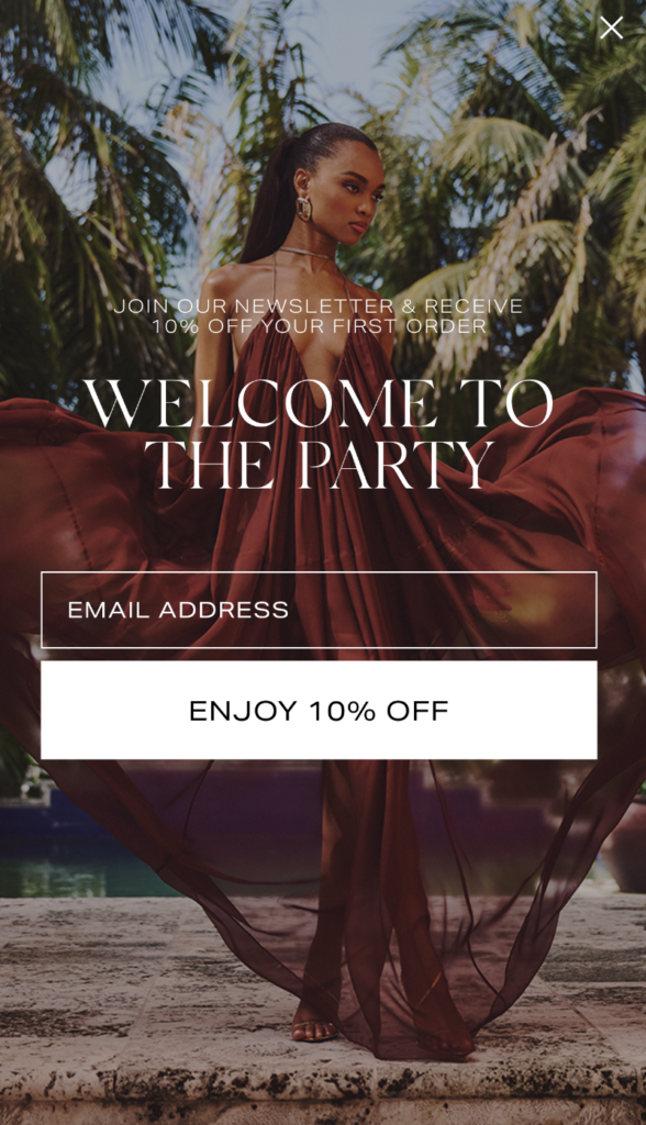
The 6th best – Retrofete.
What I like 🍀: Good because the creative is seasonal + the copy is specific to what they sell.
What I’d change 🥀: Wish it were a full screen takeover on desktop. Wish the word newsletter wasn’t used. Wish the offer of 10% was more prominent outside of the CTA.
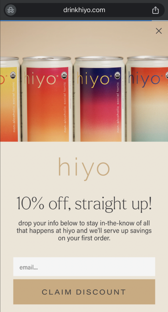
The 5th best – Hiyo
What I like 🍀: Good because it shows the full product range + the headline is really, really strong (non-alc brand and that’s so clear!!) + everything is in the brand voice except the CTA copy where they go full fucking direct response.
What I’d change 🥀: Also wish it were a full screen takeover on desktop. Wish there were more contrast in the button color of CLAIM DISCOUNT.
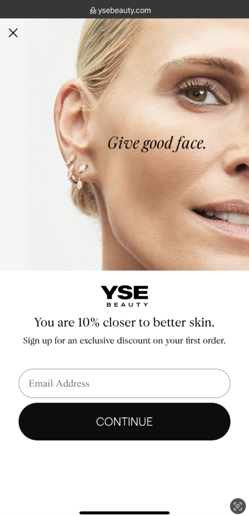
The 4th best – YSE Beauty
What I like 🍀: Good because uses their celebrity (Molly Sims) + isn’t afraid to overlay the headline over her face. Good because the CTA says continue, which in my tests has been very favorable.
What I’d change 🥀: Inconsistencies in capitalization, and once again not full-bleed on desktop.
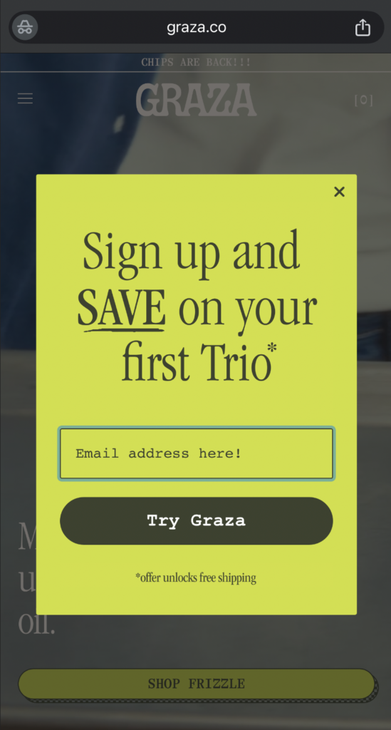
The 3rd best – Graza
What I like 🍀: THE COLOR! THE STROKE FOR EMPHASIS. THE FACT THE * ISN’T FINE-PRINT THAT RUINS THE OFFER BUT INSTEAD THE INCENTIVE. The all caps here from me are because we’ve turned a corner. This is a really, really strong showing.
What I’d change 🥀: Not a full-screen takeover on mobile nor desktop. Offer not entirely clear. Is free shipping it? Seems like it but causes slight hesitation.
Join Go-to-Millions to Learn How to Launch & Grow Your Dtc Brand
Over 50k+ subscribers get free weekly emails with insights and advice on marketing that people actually love.
No spam. Unsubscribe any time.
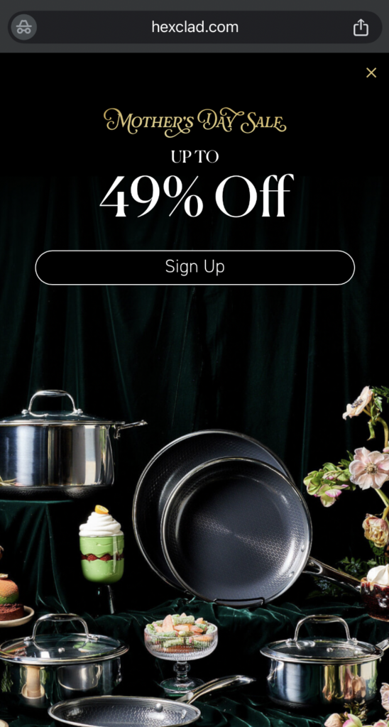
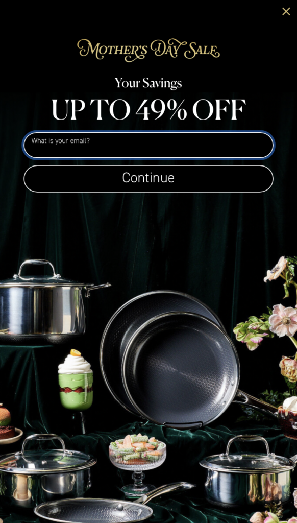
The 2nd best – HexClad
What I like 🍀: The simplicity of the 1st screen of the popup. The emphasis on that beautiful up to 49% off. The fact that Mother’s Day gets its own font. The fact that this popup is specific to this sale and this moment in time.
What I’d change 🥀: The popup fires once you’ve already seen that the deal is accessible without signing up.
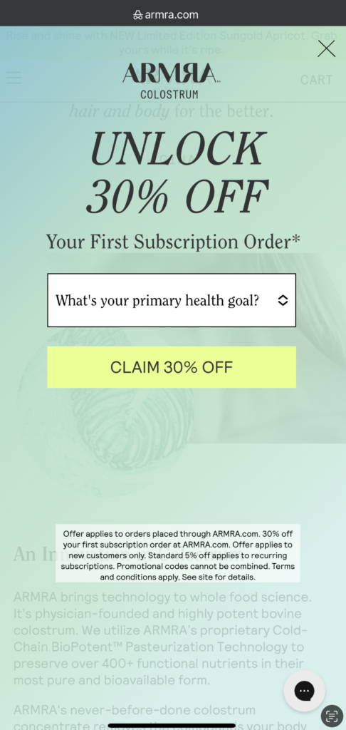
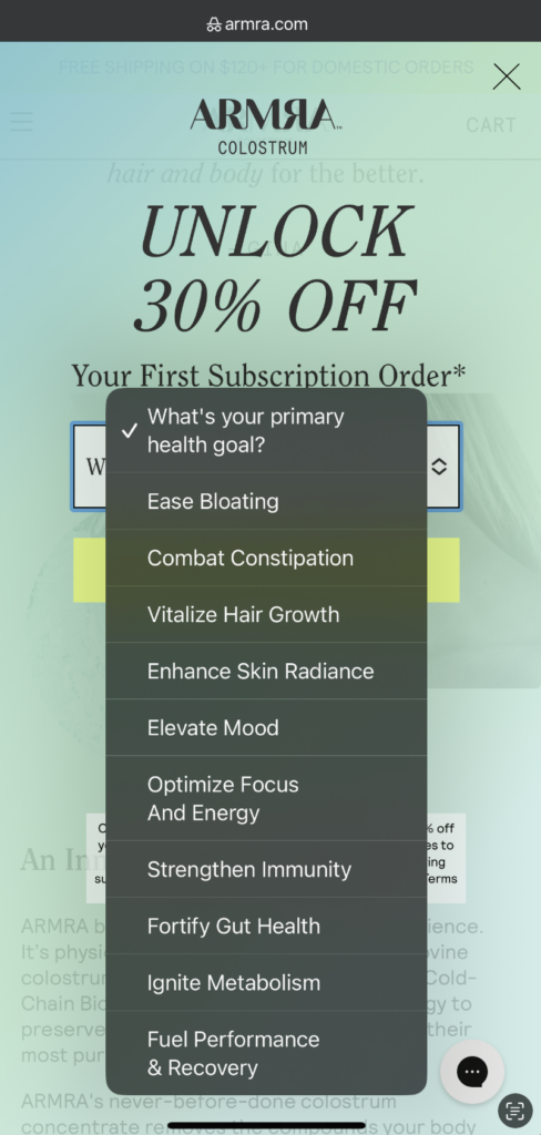
The #1 best – ARMRA
What I like 🍀: The opacity that doesn’t disrupt your experience. The quiz funnel that will allow them to personalize the experience from submit!!!!!!!! The bravery in the sheer # of options in said quiz funnel. The steep offer with no ‘up to’ qualifying language.
What I’d change 🥀: That 5% recurring offer </3.