
Websites that matter to me right now. (There’s something specific I love about each of these sites and I’ll explain what and why)…
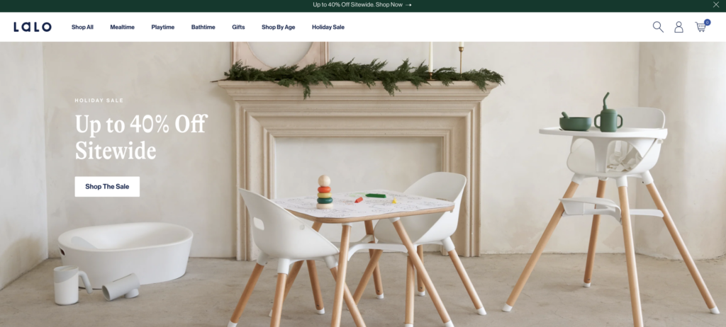
LALO: The hero homepage on desktop shows 3 important ranges – a bath tub thingy, a workdesk thingy, and a highchair. These products don’t have much in common except for the fact they are all on 40% off promo. And, that’s enough for me. Not every story needs to be perfectly cohesive. If you have 3 hero products you want to show off, don’t let the fact they are unrelated force you to spotlight loser SKUs.
BAGGU: A footer with personality. For the customers who don’t bounce and who make it all the way down the page. Reward them with something interesting to look at.

Ffern: Notice the blinking dot in the CRM popup and on the hero homepage. If you need attention on a specific action in a sea of directions, use motion. I like how the tactic is repeated twice. Feels easy to understand. Love Ffern and I’m sorry I don’t shut up about it.
Ayoh!: I love a high-effort collections page. I really do. Above-the-fold this is perfection. I am a mayo LOVER so I may be biased. Daniel and I say we’re a mayo family. For me it’s mayo then mustard and then ketchup and I’m sorry for that.
Kov: I don’t love the way this looks but I love the idea, okay? Gift guide divided very clearly by price. This is how people shop for gifts. So, let them choose the bucket they’re willing to spend into. Price then becomes a non-issue upon click. Under $30. Under $20. Under $10.

Angela Caglia: There’s no better way to message subscription. 15% Off Your First Order, 20% Off Every Order After. I stand by this. (And the product is amazing, BTW).

Sézane: Not going to lie I think this is crazy. A stacked hero homepage with 5 CTAs. But, done vertically, this works to me. I can read it clearly. I can read it quickly. I know what to click. And, I’ve never seen this before. Going to test this because this is smart.
P.S. I recently bought this dress and I really like it. In case helpful.

Harrods: File this under shipping cutoff language inspiration.
“Order your gifts by 13th December for International Delivery in time for Christmas.”
I know it’s a global banner (so technically not optimized) but this appearing on the US site is very British and cool to me. 13th December. International Shipping.
Makes the December 13th USA to USA shipping cutoffs being advertised right now feel WEAK. I don’t know if that’s the point but to me that’s the point.
Olipop: Another shipping cutoff copy winner:
To note: I prefer my shipping cutoff language to not say shipping cutoff.
P.S. Hope you’re gifting GRAPE. The best grape flavored thing in the world and I’ll stand on that.
Join Go-to-Millions to Learn How to Launch & Grow Your Dtc Brand
Over 50k+ subscribers get free weekly emails with insights and advice on marketing that people actually love.
No spam. Unsubscribe any time.