I wrote this for Go-to-Millions. Do you hate? Do you like? Will it work? (testing it so time will tell!)

I’D LIKE TO SHOW YOU:
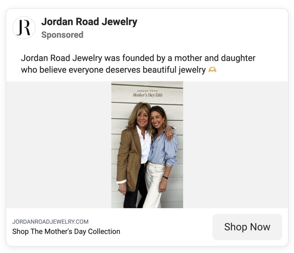
❤️: This static ad run by Jordan Road Jewelry on Meta:

🧛🏻♀️: This way of saying free shipping (Complimentary). Elevated. Test this vs. Free Shipping.
(This is hard to read because of the white on gold + script font). But the messaging is great.)

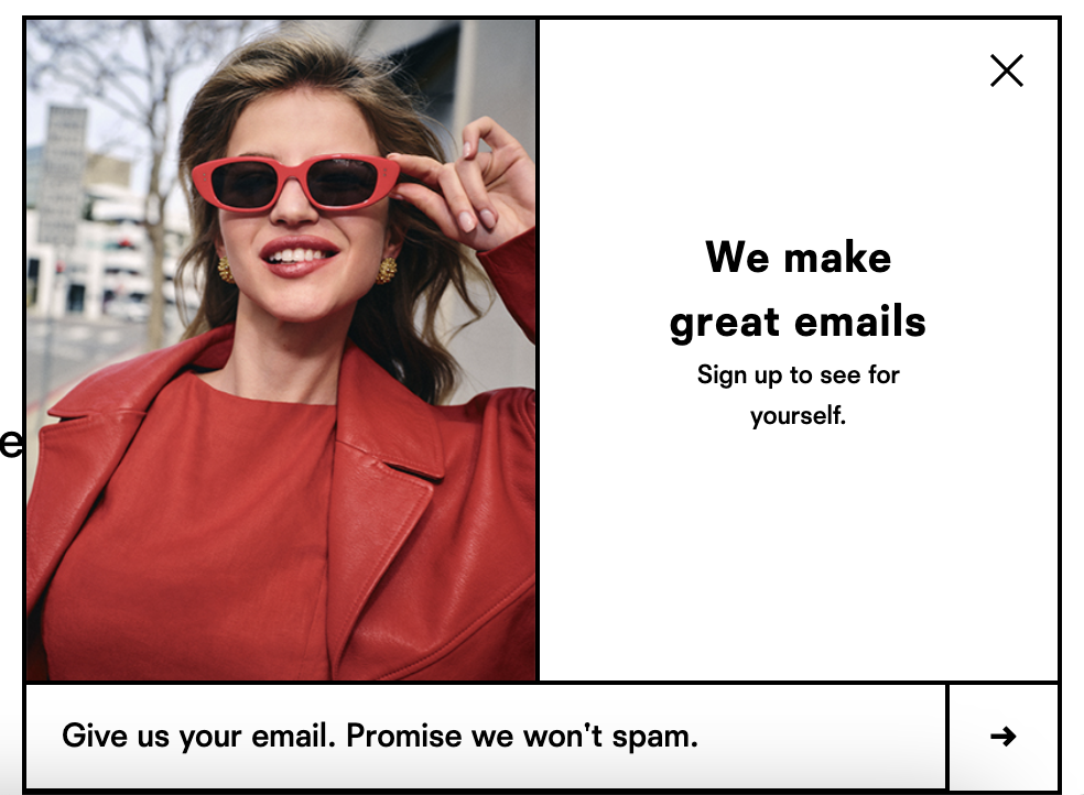
👒: This copywriting from Reformation (on their email / SMS capture):

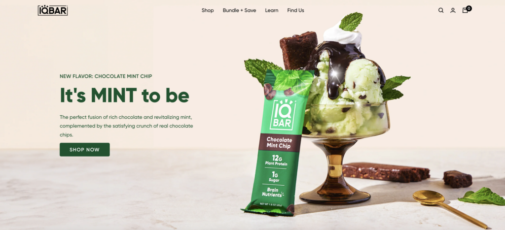
🍦: I bought this immediately once I landed on the site. I saw this on X and I was sold. I love mint. Because I landed on PDP directly, I missed the homepage hero. Now looking back, it really works for me. It’s so clear! Clever, but just a little bit.

🍦: Dedcool has changed their homepage to a new summery creative, but I love this old version of the homepage hero and am petitioning for them to bring back the ocean element).
The version below (my preferred version) is no longer but it’s in my swipefile so sharing with you.
I’ve said it once and I’ll say it twice (Dedcool does this well always no matter the creative): if it’s the summer, lean into the ocean. If it’s the fall, show me leaves. If its the winter, snow. If it’s spring, calla lilies.


