Funnel Hacking: OSEA Malibu
Twitter might call this ~funnel hacking~.
In reality, there’s no better way to study a brand, or a business, then to behave like a customer.
With that, let’s funnel hack our little hearts out! OSEA Malibu, you’re up!

Step 1: Search for the brand on Google.
*you’re about to get set yourself up to get hit with a bunch of the brand’s ads – this is what we’re going for! You can also always stalk a brand’s ads via TikTok’s Creative Center and check out their ads via Facebook Ads Library – free and shows you not only what creative is out and about – but where that creative leads (landing pages, collections, PDP, you name it).
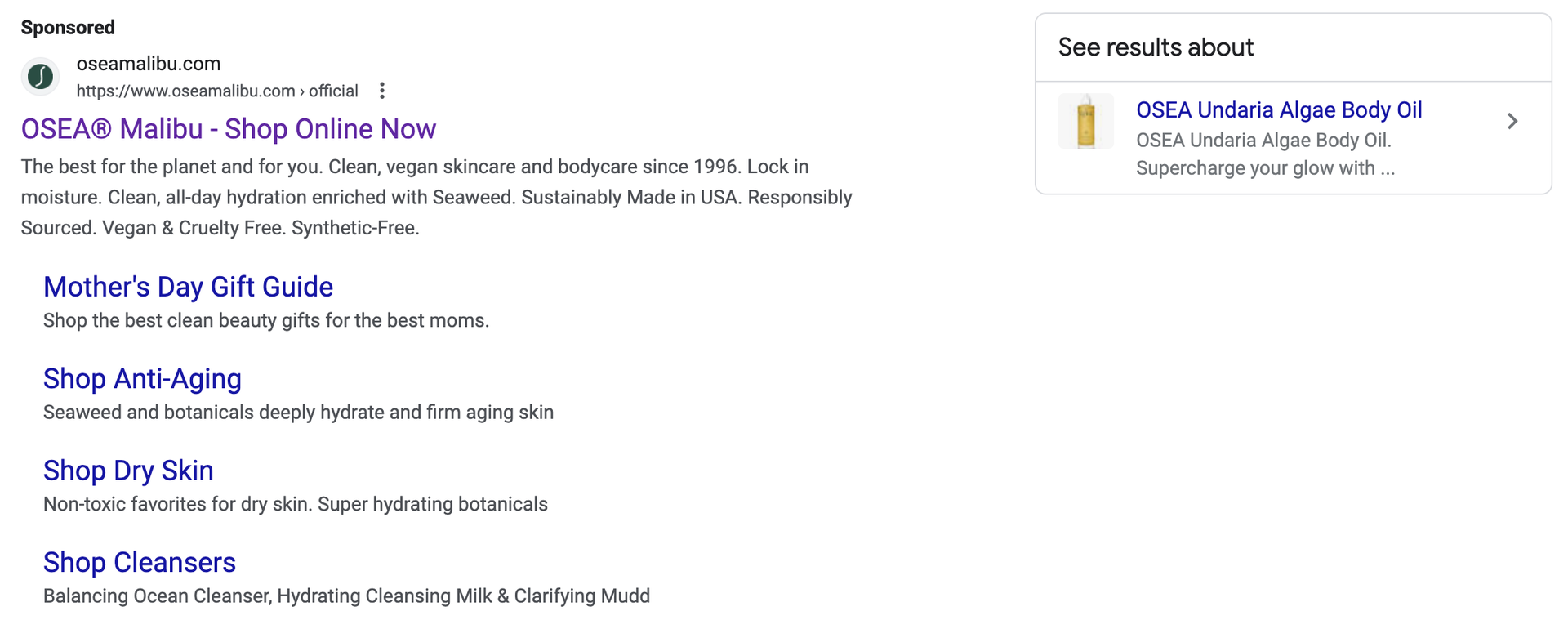
OSEA Malibu is running paid search. What’s amazing to see is that they are not just blocking out the competition (no other brands are shown on the 1st page of the search results), but they are also blocking out the marketplaces and 3rd party retailers that sell their brand. Their DTC is boxing out. Amazon is at the bottom of the page. Ulta is at the bottom of the page. If you go to Google Shopping, they are less blessed – more of a mix and Amazon appears early. But, a job well done by team OSEA here – Ulta barely makes it to page 1!
Step 2: Click through to the brand’s website.
Rule #1 in supporting the brands you like – don’t click their sponsored placements. Scroll until you find the organic listing. Promise me, okay?
Now that I’m on the site let’s stalk the tech stack. Here we can see a Shopify site equipped with:
: Klaviyo for email
: Segment for cross-device tracking
: Grin for influencer management
: Northbeam for attribution
: Refersion for affiliate
: Gorgias for CX
: and Recharge for subscription
Join Go-to-Millions to Learn How to Launch & Grow Your Dtc Brand
Over 50k+ subscribers get free weekly emails with insights and advice on marketing that people actually love.
No spam. Unsubscribe any time.
Of the above, I use Shopify (well, Shopify Plus), Klaviyo, Northbeam, and Gorgias in my always-and-forever tech stack.
Step 3: Enter your info.
On desktop, the email capture is set on a delay. Which, is super interesting (feels like ~7 second delay but I’m bad at math so don’t quote me).
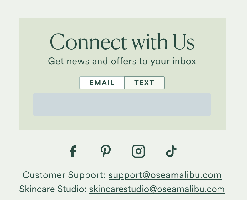
On desktop, the email / SMS form in the footer is BROKEN for TEXT. If I can see it on desktop, and you don’t have the ability to capture phone number on desktop, hide the toggle. OSEA, if you’re reading this, please change that because could be frustrating to the customer (non frustrating to me because I have heard such good things about your body oil that I forgive you – just this once).
Step 4: Open the welcome email + SMS.
(so that you can JUDGE IT – I mean LEARN from it).
Love this welcome email. I feel part of something – I am rooting for this family.
Would I love to bring the discount code a bit higher? Yes. Would I prefer the discount code was something OSEA-related (it’s a WELCOME code with a string of dynamic #s).
I AM TEAM WHO CARES IF YOUR WELCOME CODE LEAKS. Let it be something easy to type and a moment to remember. If someone wants 10% off of my site to complete their order – say less. New customers are hard to come by – make it easy to shop your brand.
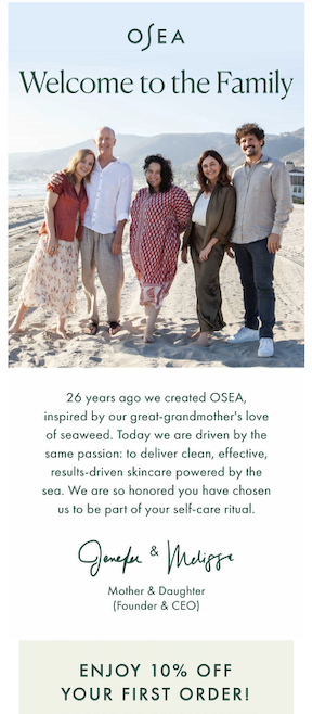
Step 5: Click the CTA in the email
The link drops us right to a shop all collection. I’m not mad at it! There’s a really easy way to filter, there are best-sellers featured, product badges, and I am not overwhelmed.
I’m easily overwhelmed – so this is great.
Step 6: Shop around!
Look at OSEA’s homepage + PDPs + add whatever catches your eye to your cart.
My specialty!
♀️ Step 7: Judge the PDP ♀️
Here’s what I love about the OSEA PDP:
1️⃣. The big and bright and prominent Allure Beauty Award. This instills so much confidence – I genuinely do whatever this badge says. Usage here is SO WORTH IT. It’s a badge that can REALLY help to add incremental value. This eye cream is def on my buy list. (Next time I order lol – I ordered other stuff today).
2️⃣. Everything about this buy-box WORKS.
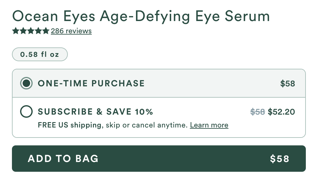
Here’s what I would change about the OSEA PDP:
1️⃣. We are in desperate need of a secondary CTA color. If your entire page is written in your on-brand green HEX color, then your CTA cannot pop. I need a secondary color here – please! This alone is worth testing and I bet they make more money if they introduce more contrast.
2️⃣. The 1st image of the carousel is blurry (the cap especially). Maybe I need glasses, but this could be tightened up (immediately, with no dev, and with either a really good designer or by choosing an asset that was shot in real life and then cleaned up). I really don’t like this photo – we need to SEE the product without booking a trip to the optometrist.
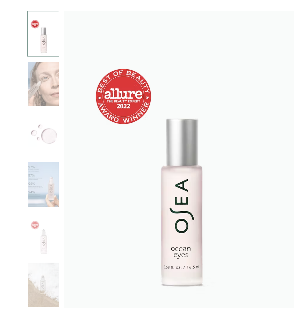
♀️ Step 8: Let’s Order! ♀️
We’ve added to cart! (The best part). The cart here is GREAT. Again, a contrast color would do wonders. The upsell here also isn’t perfect for my cart scenario.
I have a body oil and a body scrub in my cart – it’s upselling me to replace the scrub I chose with a different scrub – that costs the same. That would trigger the bundle discount – but that’s annoying. I want the scrub I want and the oil I want – why can’t my 2 products that are in that exact format not trigger the bundle? Why can’t you make me a bundle to reward me for buying 2 things that are in the AOV you’re pushing?
I still bought it tho – I can’t help myself lol.
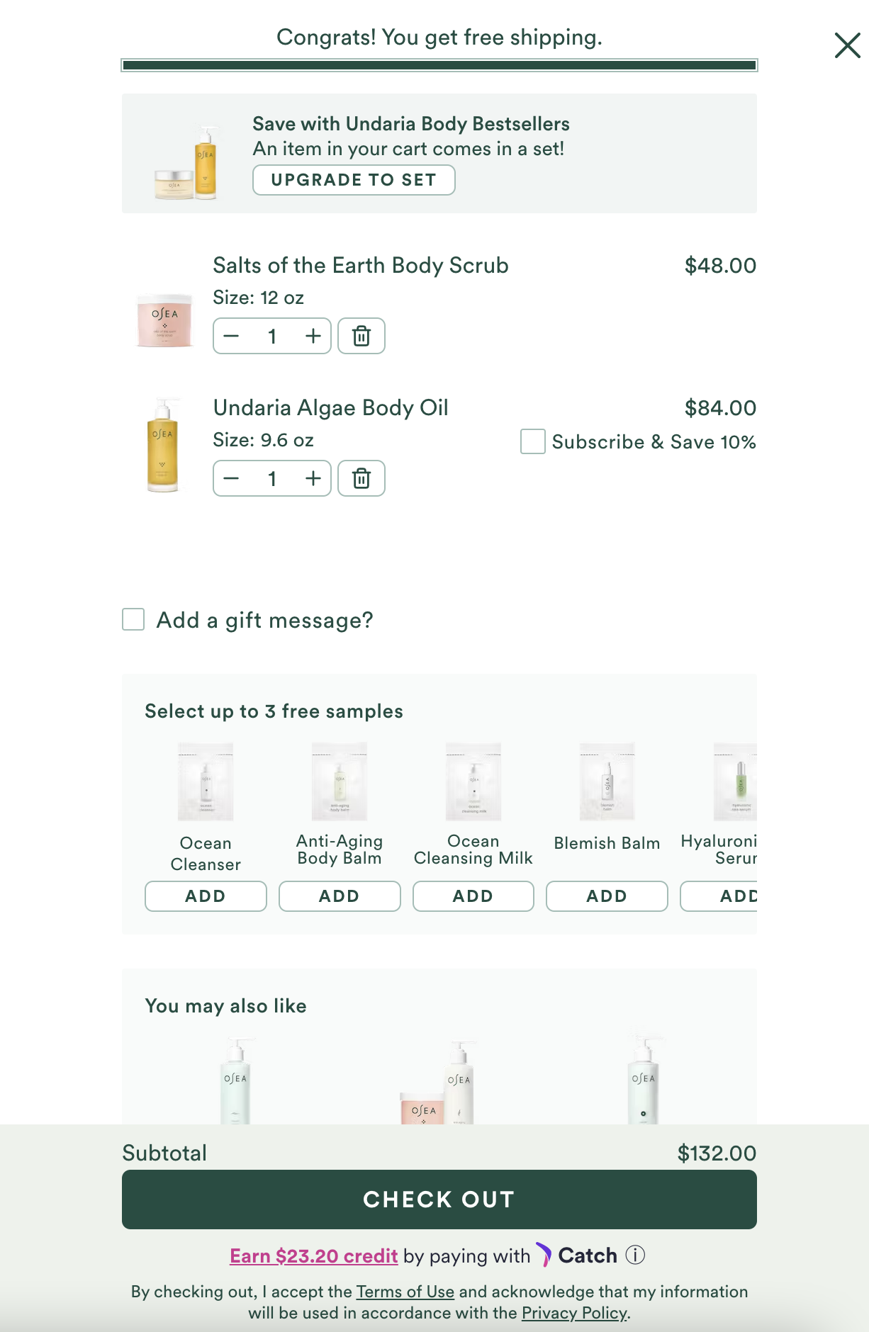
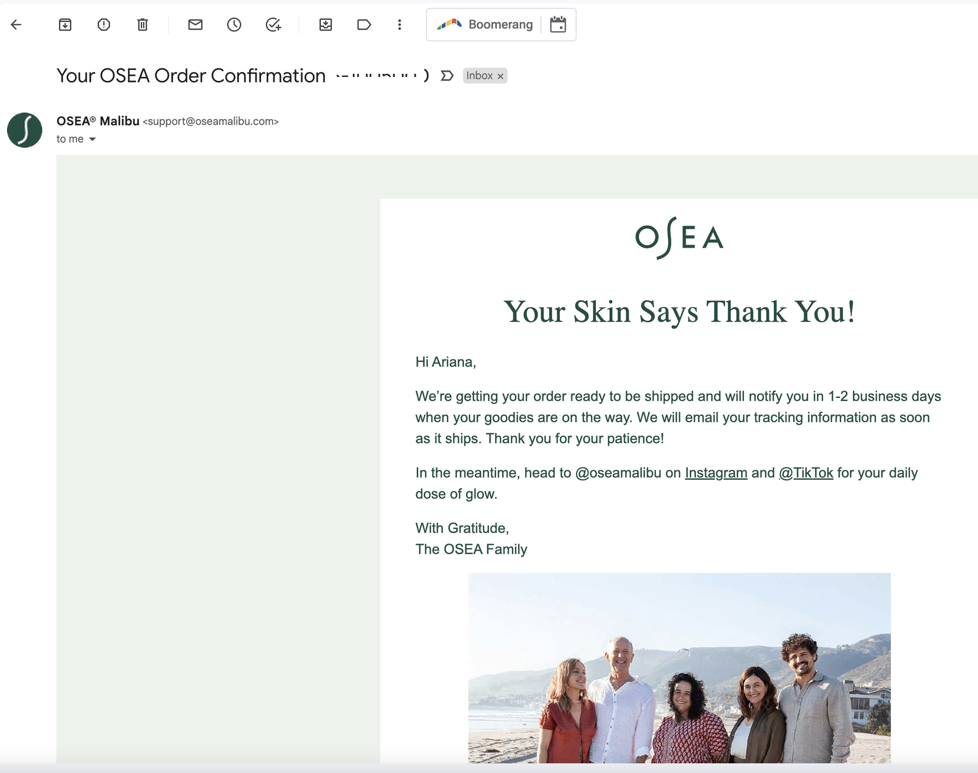
Step 9: Our order begins its journey
I’ll let you know all about the packaging, the communication between order placed and order delivered, and importantly – if this was worth buying.
A journey of a thousand credit card points miles begins with a single purchase.
