1️⃣: SET ACTIVE’s email capture animation SPEAKS TO ME.

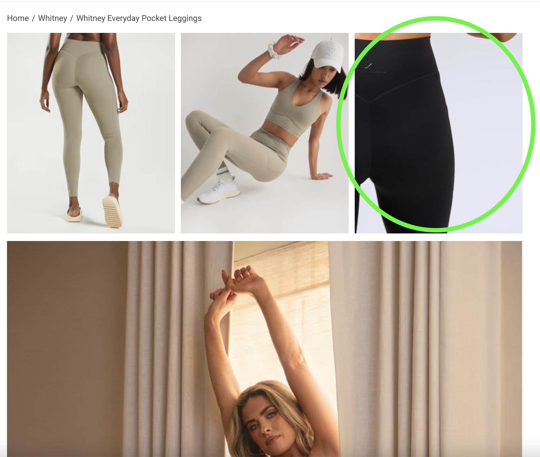
2️⃣: GYMSHARK’s collab PDP (with my idol Whitney Simmons) is everything. A) it shows the creator, but also other models that help to round out the page and make this more accessible to different bodies and different people. B) The carousel image layout includes MOVEMENT, in a non-distracting and INTENTIONAL WAY.

3️⃣: NET-A-PORTER calling their activewear collection NET-A-SPORTER is cheeky. I appreciate it. Bonus-points: it’s so f’ing well curated.
4️⃣: YETI’s website is okay. But, they do something that really tickles my fancy. I LOVE TO SHOW VARIANTS IN THIS WAY. Would you rather see a shade/ swatch bubble that is navy, or the exact product you’re about to order in the exact shade you’re exploring. Exactly.
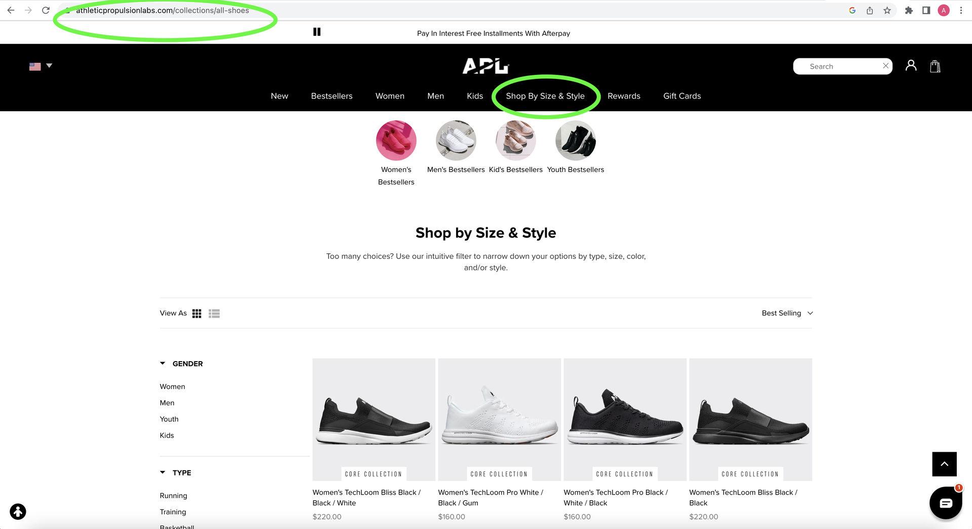
5️⃣: APL is genius for this. THIS IS JUST THEIR SHOP ALL. Sure, there’s an advanced filtering system in play, but this is a shop all collect. BUT LOOK WHAT THEY NAMED IT IN THEIR NAV!!! ‘Shop by Size & Style’ – so very smart because when you’re looking for running shoes, that’s exactly what you’re trying to do. Shop by Size & Style. I’M GOING TO STEAL THIS.

6️⃣: BOMBAS’ site isn’t exactly full of bells and whistles. And, that works so well for them. THIS IS A GREAT EXAMPLE OF CLEAR > CLEVER. FUNCTION > FORM. On homepage after just a very quick scan, I can see that we’re B-CORP Certified, there’s a prominent HAPPINESS GUARANTEE, there’s a discount code there for the taking in the promobar, and the ONE PURCHASED = ONE DONATED messaging is clear as day.
7️⃣: OURA RING’s this PDP makes me grateful for the free sizing kit AND the ability to over-ride that feature should you know your size already. DON’T ASSUME EVERY CUSTOMER IS AT THE SAME POINT IN THEIR JOURNEY. NEVER FORCE THEIR HAND (or finger).


